
Logo Usage
Review the general guidelines for The Ad Council logo usage on all media types.
Logo Placement
The recommended Ad Council logo placement is on bottom left, however there is flexibility based on creative design to position the logo on any of the other corners.
This placement will ensure that logo reconfiguration and/or elimination is prevented.
The Ad Council logo must be no smaller than 100% of the size of the sponsor organization’s logo and no smaller than .375" in width.
Download Ad Council Logos
The clearance space around the Ad Council logo should be the x height of the logo (height of the letter “a”).
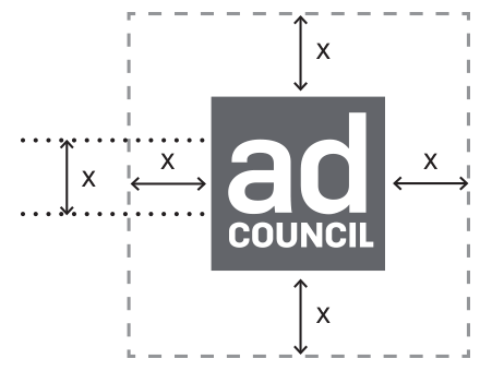
The same distance of x must be used between the Ad Council logo and other logos.


This placement will ensure that logo reconfiguration and/or elimination is prevented.
The Ad Council logo must be no smaller than 100% of the size of the sponsor organization’s logo and no smaller than .375" in width.
Download Ad Council Logos
Positioning in Ads
The clearance space around the Ad Council logo should be the x height of the logo (height of the letter “a”).
Positioning With Other Logos
The same distance of x must be used between the Ad Council logo and other logos.
Correct Logo Usage
Logo Color
The Ad Council identity emanates from the simple square form of the logo, the visual system represents the far-reaching impact of the Ad Council.
PRIMARY LOGO COOL GREY 10

KNOCKOUT IN BLACK & KNOCKOUT IN WHITE
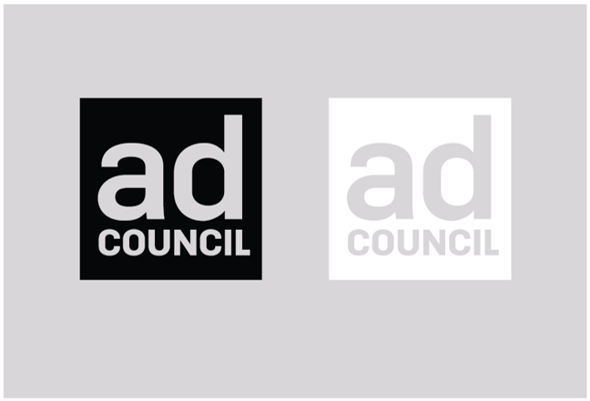
PRIMARY LOGO COOL GREY 10
KNOCKOUT IN BLACK & KNOCKOUT IN WHITE
Logo Don'ts
These iterations of the logo lack brand and visual integrity and should be avoided.
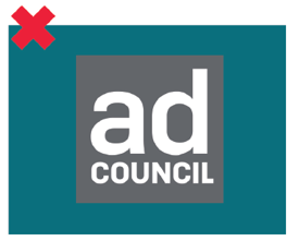
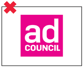
Do not use a logo color version with inappropriate contrast for its background
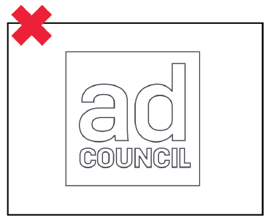
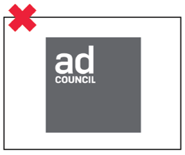
Do not outline the logo
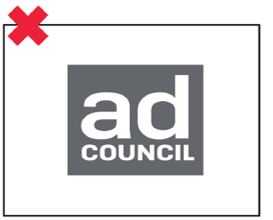
Do not change the color of the logo
Do not squash, skew, or distort the logo
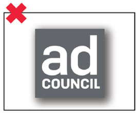
Do not add effects to the logo
Do not change placement or proportion of logo to square
Do not use a logo color version with inappropriate contrast for its background
Do not outline the logo
Do not change the color of the logo
Do not squash, skew, or distort the logo
Do not add effects to the logo
Do not change placement or proportion of logo to square